TL;DR
The Problem
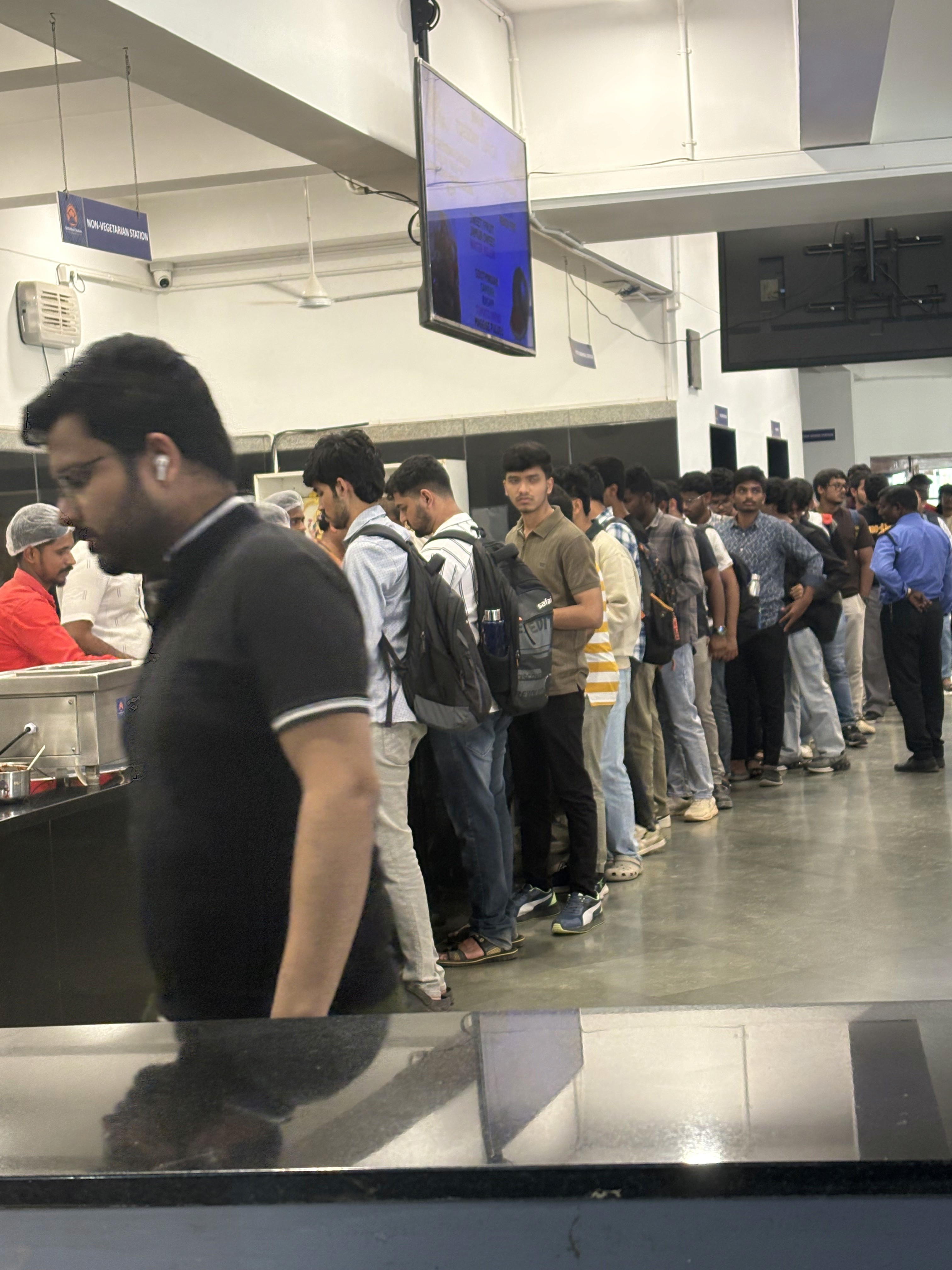
The campus canteen was the easiest way to eat, yet it was riddled with issues: long lines, noisy menus, mostly oily or artificially coloured food, and no sense of calories or protein just as students were trying to eat “healthier” on tight budgets.
The Research
Observations and student conversations surfaced four clear archetypes who all behaved the same way, and so I designed for the shared behaviour rather than for four separate people
The Solution
A four‑option meal‑plan layer that sits alongside the canteen, with transparent calories/macros, predictable pricing, and small swappable components prepared by the existing kitchen.
Type of project
Passion project to solve a problem I noticed my brother was facing while going to college
Timeline
2 weeks
Context
Where does this problem live?
The canteen trap
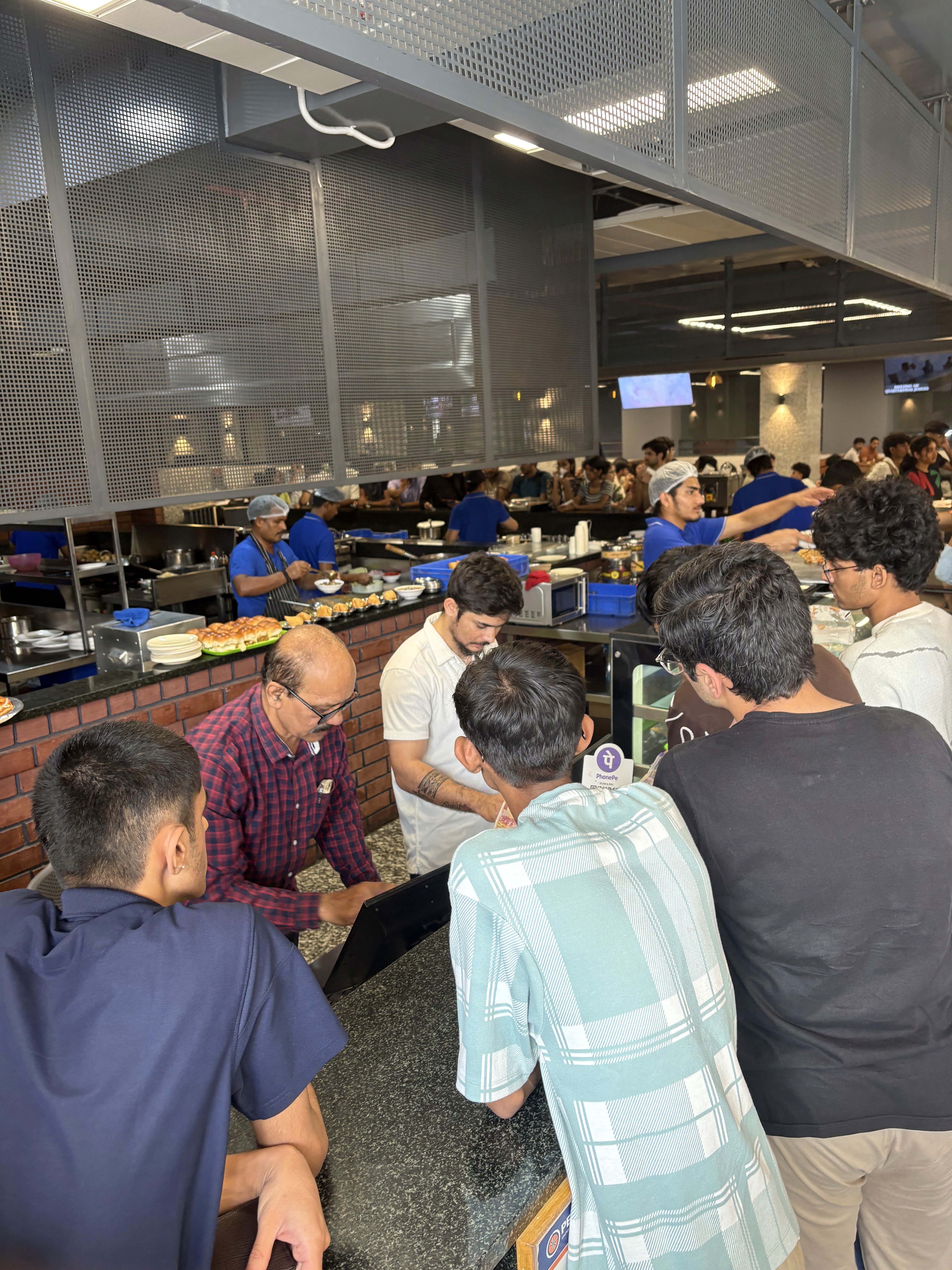
The canteen is convenient and familiar, although most meals are chosen under time pressure, from an overloaded board, with almost no sense of how healthy or filling they actually are.
As a student I never realised this while I was placing my own orders, this taught me how researching as an unbiased third party helps you learn a lot more than you think.
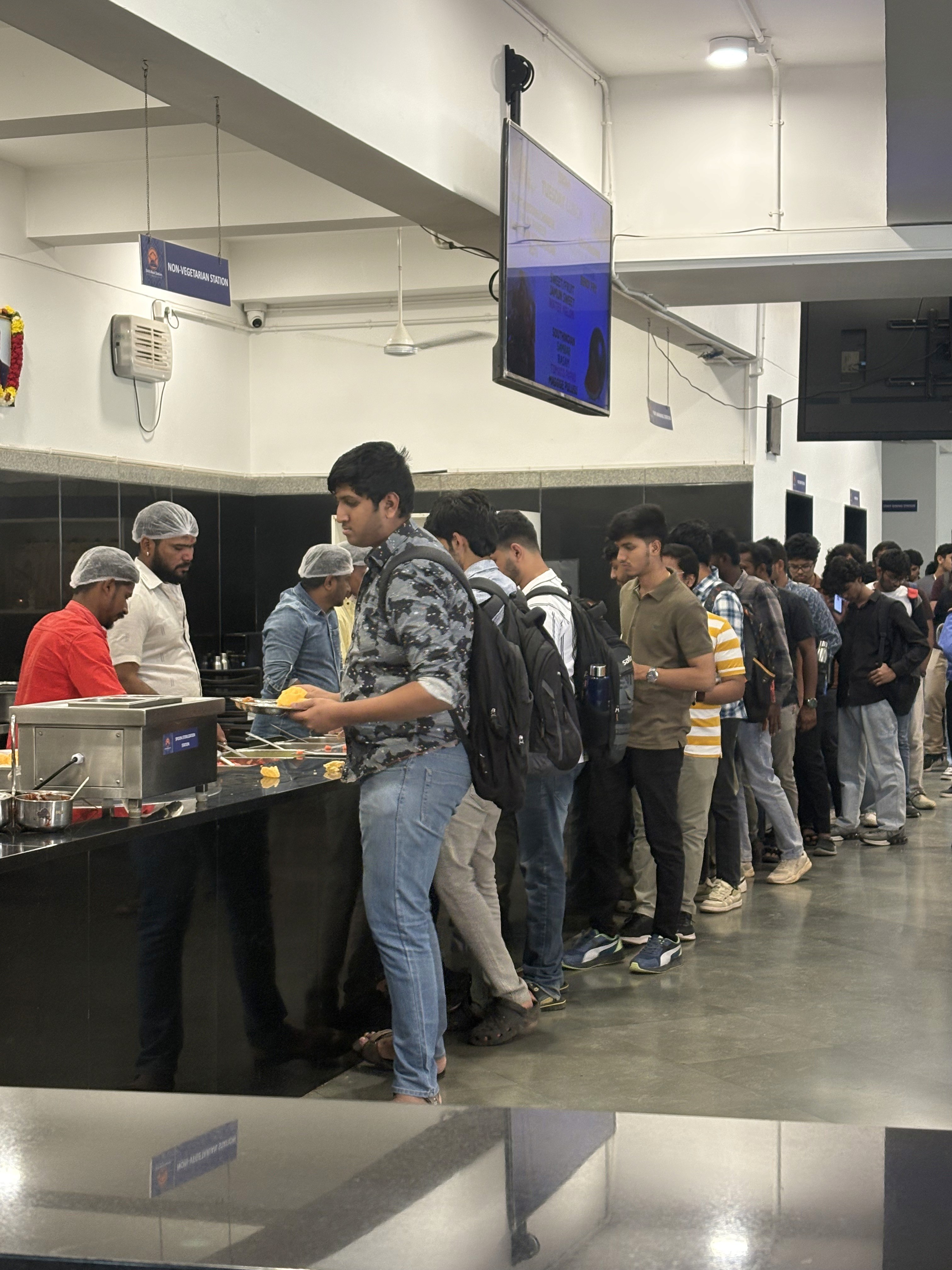
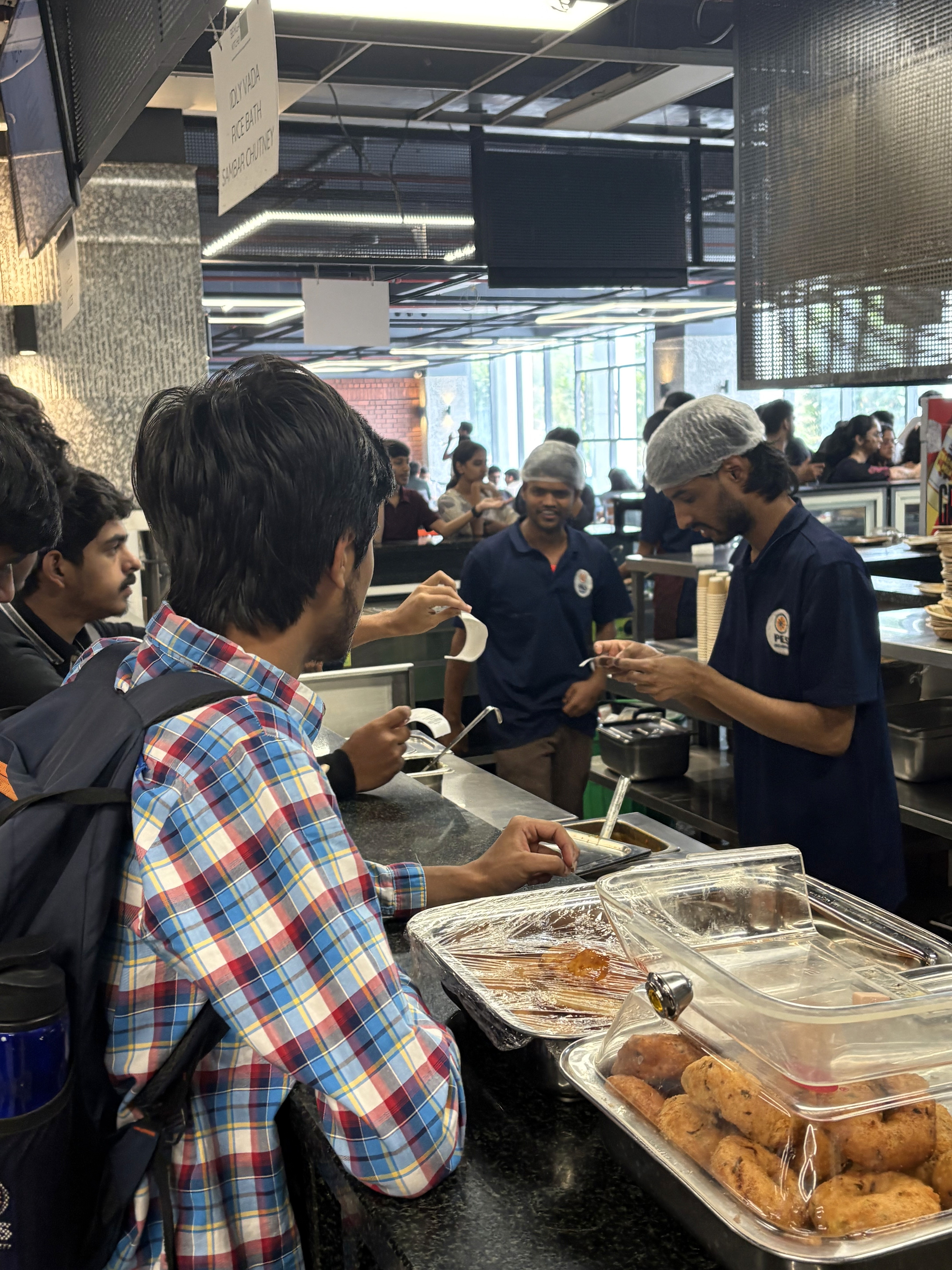
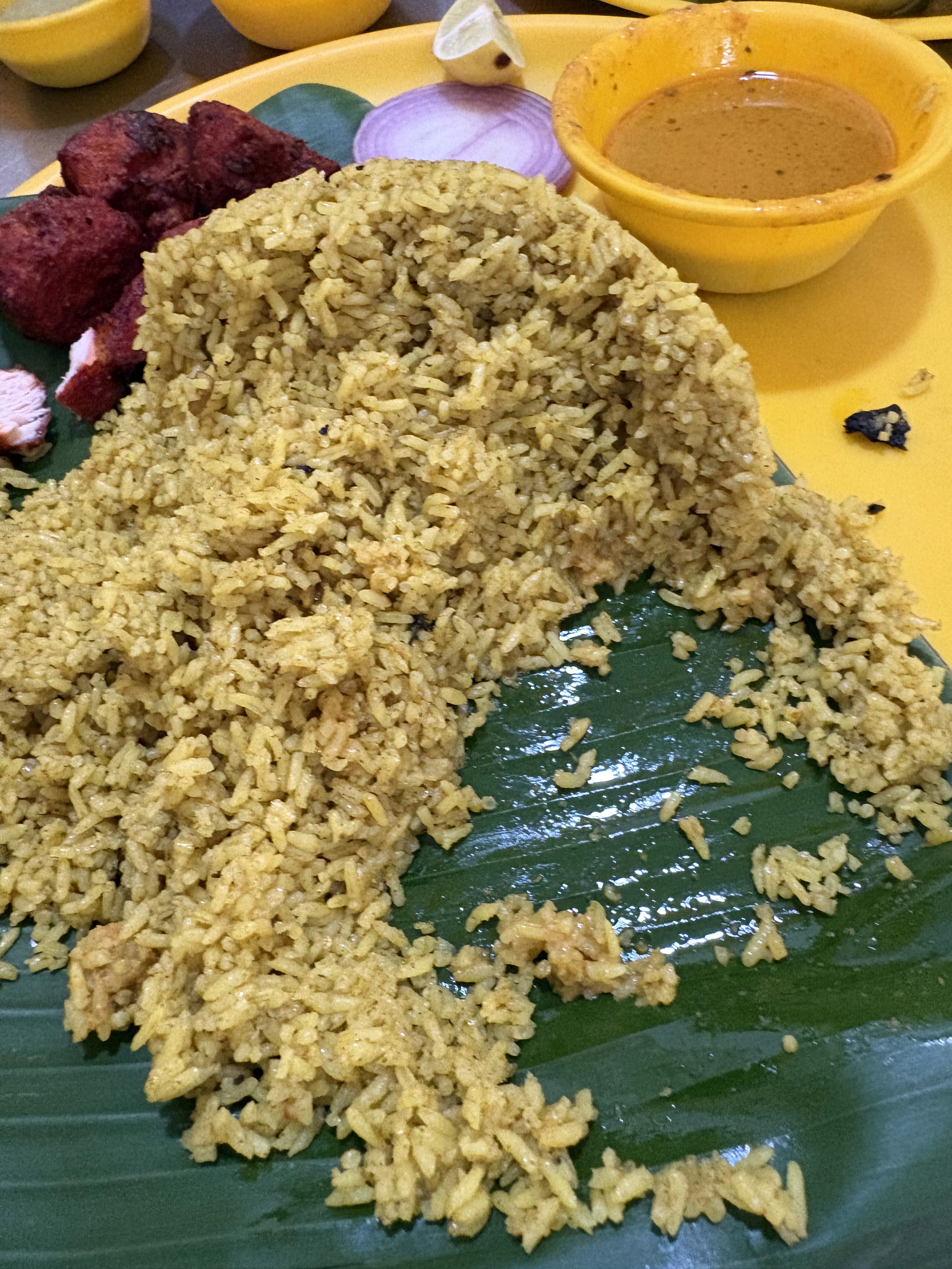
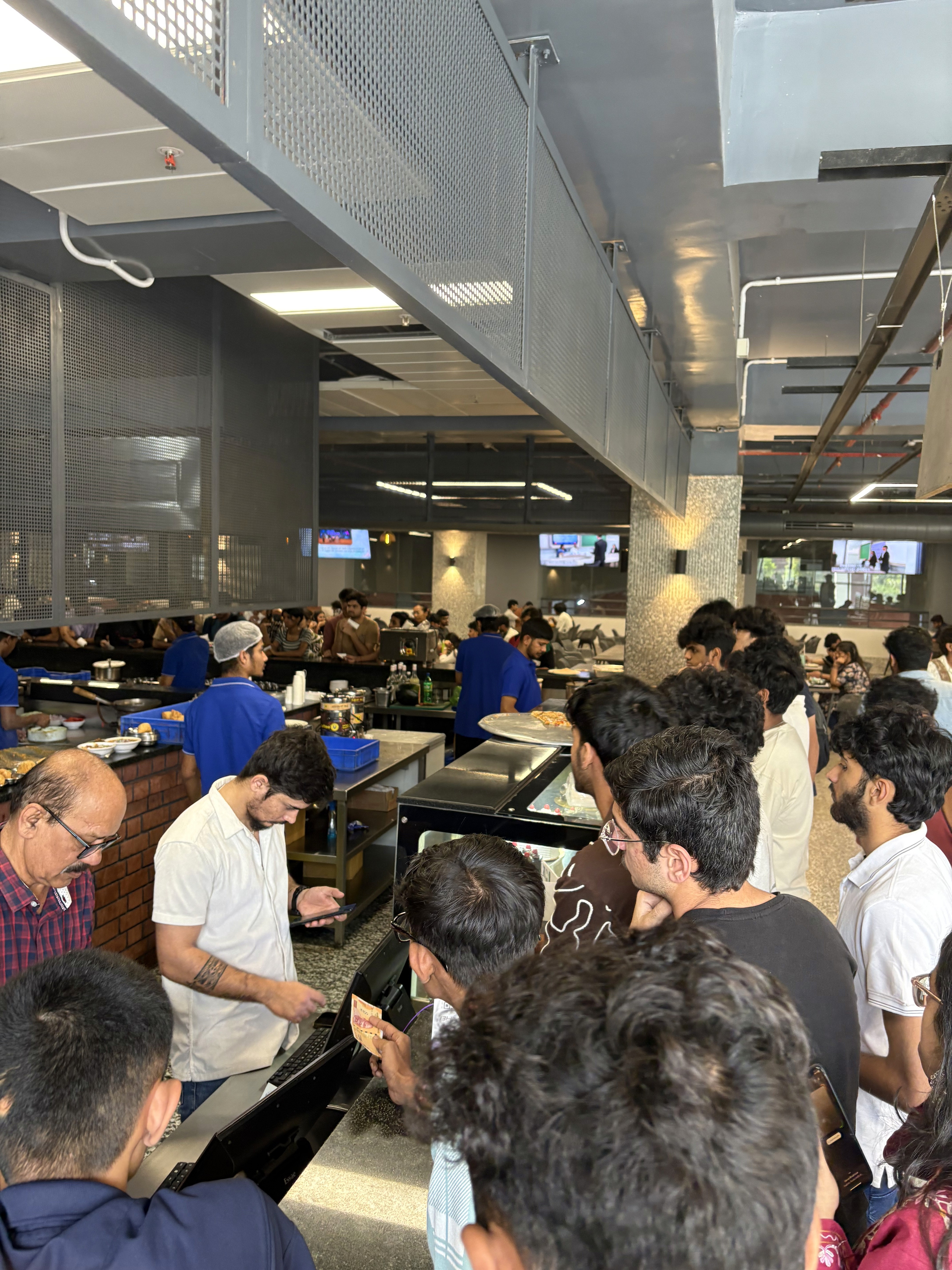
Within these constraints, the challenge wasn’t to reinvent the canteen from scratch, but to wrap it in a structure that made better everyday decisions feel just as easy as grabbing the usual.
Could work with
The existing canteen kitchen and staff.
Digital flows for planning, payment, and pickup.
Students’ growing interest in “eating better” and “more protein”.
Could not change
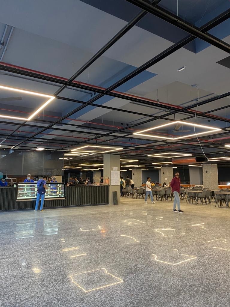
No new buildings, vendors, or extra kitchen lines.
No turning the canteen into a strictly “health food” outlet.
No expectation that students count every gram or track every meal.
Had to respect
Tight student budgets and fixed monthly allowances.
Short meal windows between classes.
The canteen’s role as a social, sometimes “cheat‑day” space.


Personal Learning
Starting off, I was under the bias that we would have to create an app where students had access to the menu, ability to place an order directly to the canteen without the hassle of coming and waiting in line in the canteen. But the research opened up the possibility that this was not what was needed.
Personal Learning
Instead of another food‑ordering interface, the situation called for a different idea entirely: fewer, better‑defined meals that took the thinking out of everyday choices. Sometimes it is not a design based change, it is often a system based change that suits the solution the best.


What does the solution look like in practice?
The insights turned into a few focused screens rather than a giant feature list. Each one is designed to remove a specific bit of friction without changing how students naturally use the canteen.
Impact
This is a concept, and here's the part I haven't proved
The four plans solve a decision problem I watched happen for weeks, but I haven't yet watched a single student use them. What follows is what the design is betting on, and what it would take to find out whether the bet holds.
For the canteen
Pre‑selected lineups give the kitchen a stable demand picture, making batch prep and portioning easier and cutting waste.
A separate pickup flow for planned meals thins peak‑time queues without new counters.
The bet
The whole structure assumes students will accept fewer options as long as those options are legible.
If they treat four plans as just another menu and go back to scanning, nothing else in the design matters, because the core move has failed.
The cheapest way to find out
None of this needs an app to test.
I would print the four plans on a single sheet, tape it beside the counter for two weeks, and count how many orders come off the sheet against how many come off the board.
If it doesn't move orders on paper, it won't move them on a phone either, we learn that for the cost of printing.
What the canteen has to agree to
Fixed pricing across all four plans, one prep slot before the lunch rush, and absorbing the cost of the streak discount.
Those aren't design decisions, they're commercial ones, and the concept doesn't survive without them.
Learnings
What did I learn as a designer?
Reframing from “fix the ordering UI” to “fix the decision” led to a more honest, useful solution than just polishing a menu.
Limiting visible choices to a small set of strong defaults can respect students’ time and energy more than exposing the full menu.
Treating the canteen as a partner, kitchen, staff, pushed the work from screen design into system design.
A few sharp observations and conversations were enough to justify a pivot. The value was in how clearly each insight translated into a design move.